

ComfyUI is under active development, so some details here may be outdated. If you spot something that’s changed, feel free to help us update the docs.
Nodes perform operations
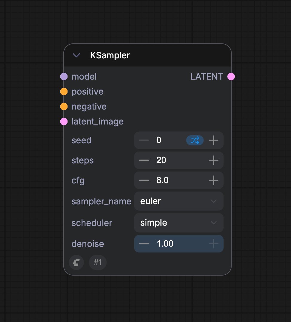
Most nodes accept input, do a job, and produce output. A Load Checkpoint node, for example, loads a model that other nodes can use. A Save Image node receives the final image and saves it. The connecting lines are called links.Different Node States
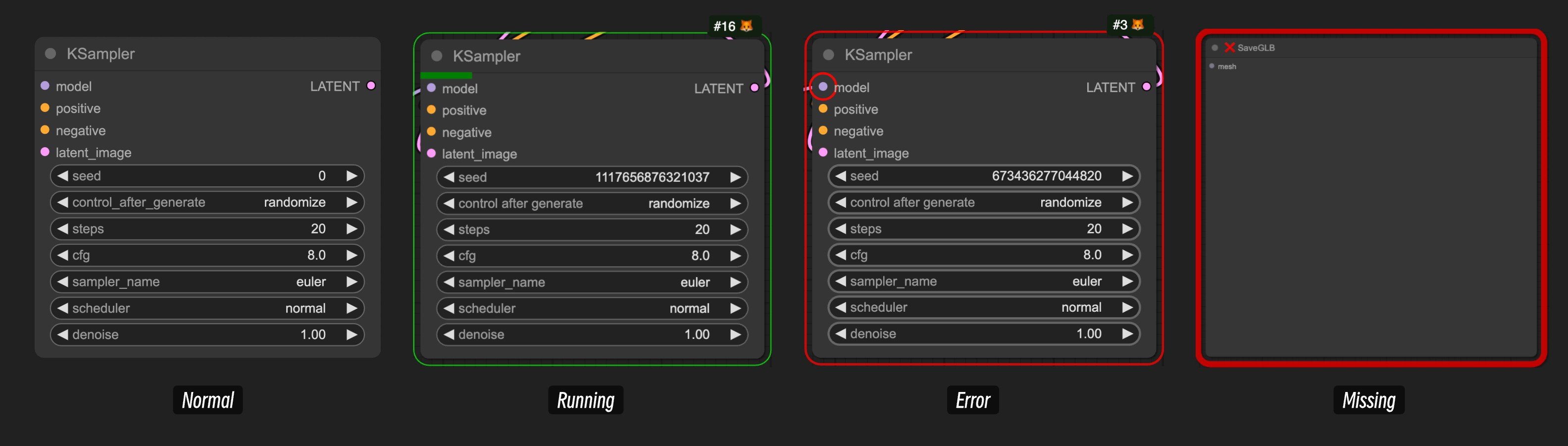
- Normal State: The default state
- Running State: The running state, typically displayed when a node is executing after you start running the workflow
- Error State: Node error, typically displayed after running the workflow if there’s a problem with the node’s input, indicated by red marking of the erroneous input node. You need to fix the problematic input to ensure the workflow runs correctly
- Missing State: This state usually appears after importing workflows, with two possibilities:
- Comfy Core native node missing: This usually happens because ComfyUI has been updated, but you’re using an older version of ComfyUI. You need to update ComfyUI to resolve this issue
- Custom node missing: The workflow uses custom nodes developed by third-party authors, but your local ComfyUI version doesn’t have these custom nodes installed. You can use ComfyUI Manager to find and install them, or follow How to install custom nodes for other methods
Connections Between Nodes
In ComfyUI, nodes are connected through links, allowing data of the same type to flow between different processing units to achieve the final result.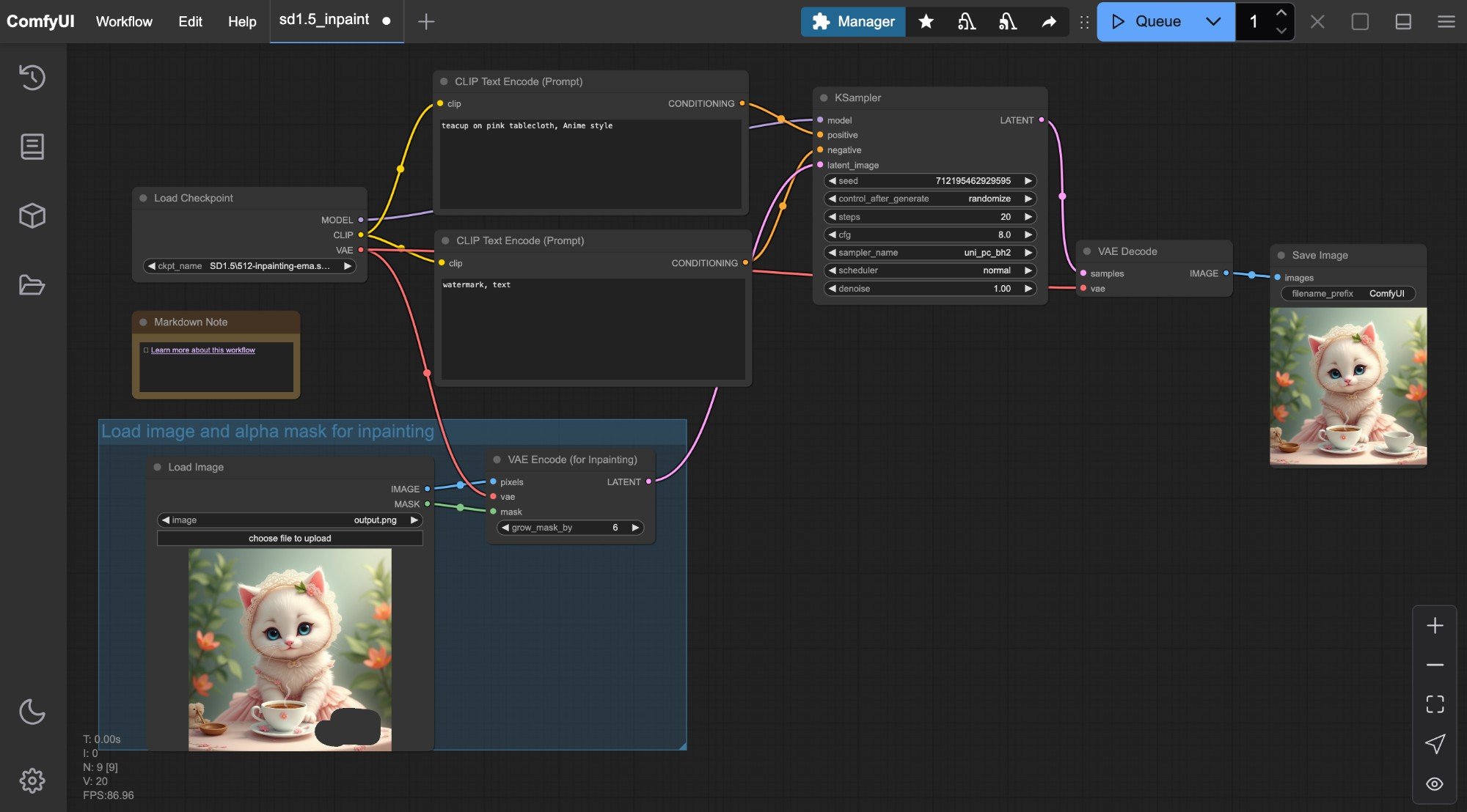
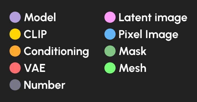
As ComfyUI evolves, we may expand to more data types to meet the needs of more scenarios.
Connecting and Disconnecting Nodes
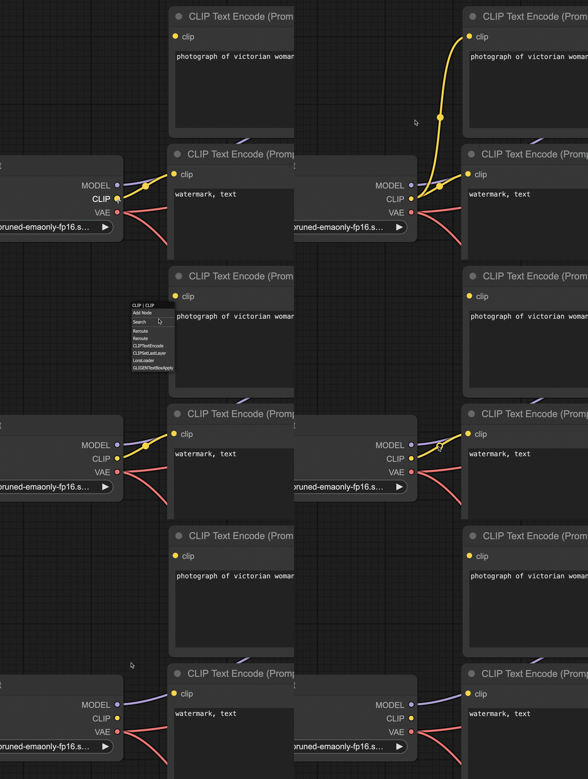
Node Appearance
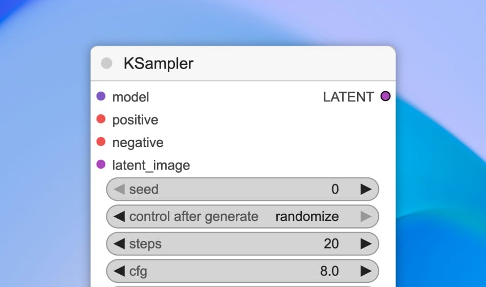
- Modify styles
- Double-click the node title to modify the node name
- Resize the node by dragging any corner
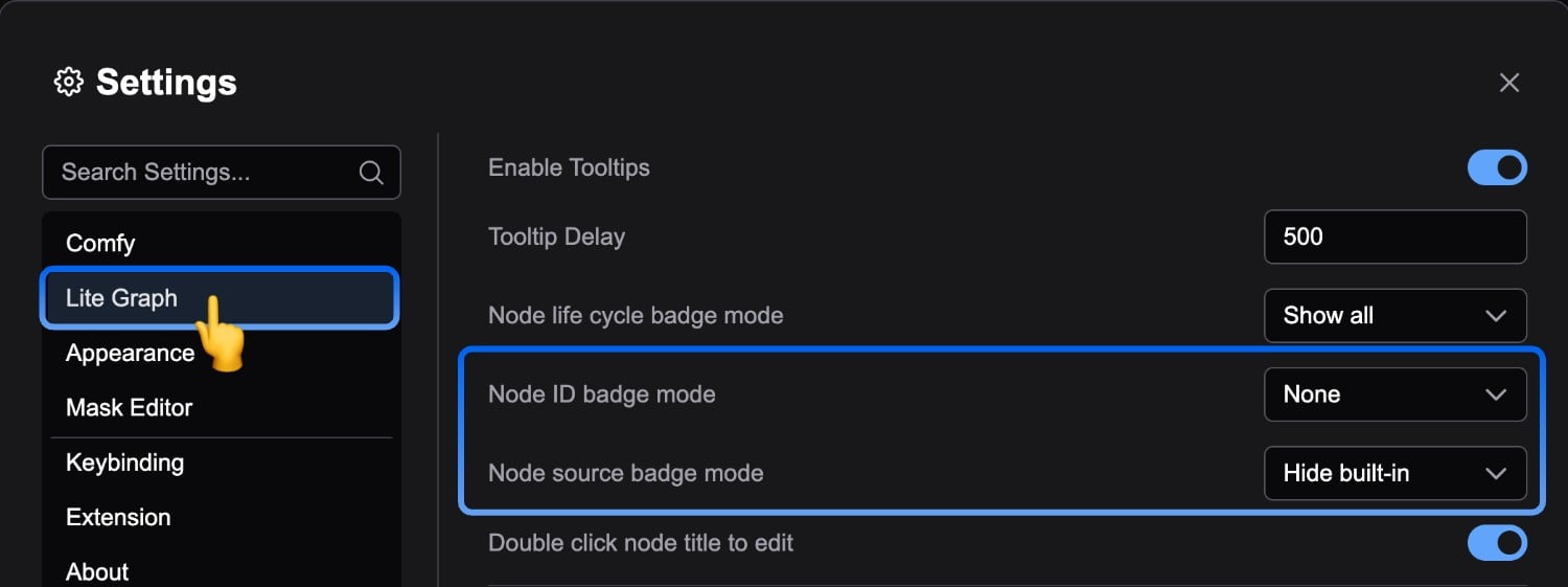
Node Badges
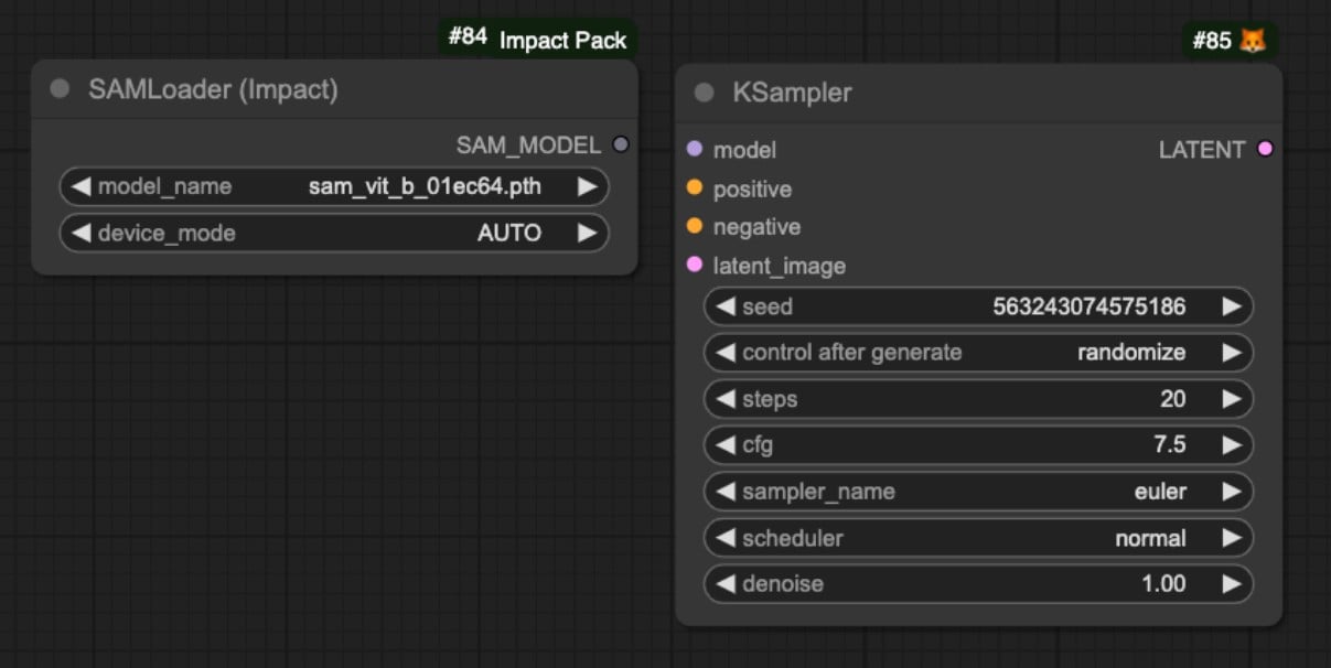
- Node ID
- Node source
Node Context Menus
Node context menus are mainly divided into two types:- Context menu for the node itself
- Context menu for inputs/outputs
Node Context Menu
By right-clicking on a node, you can expand the corresponding node context menu: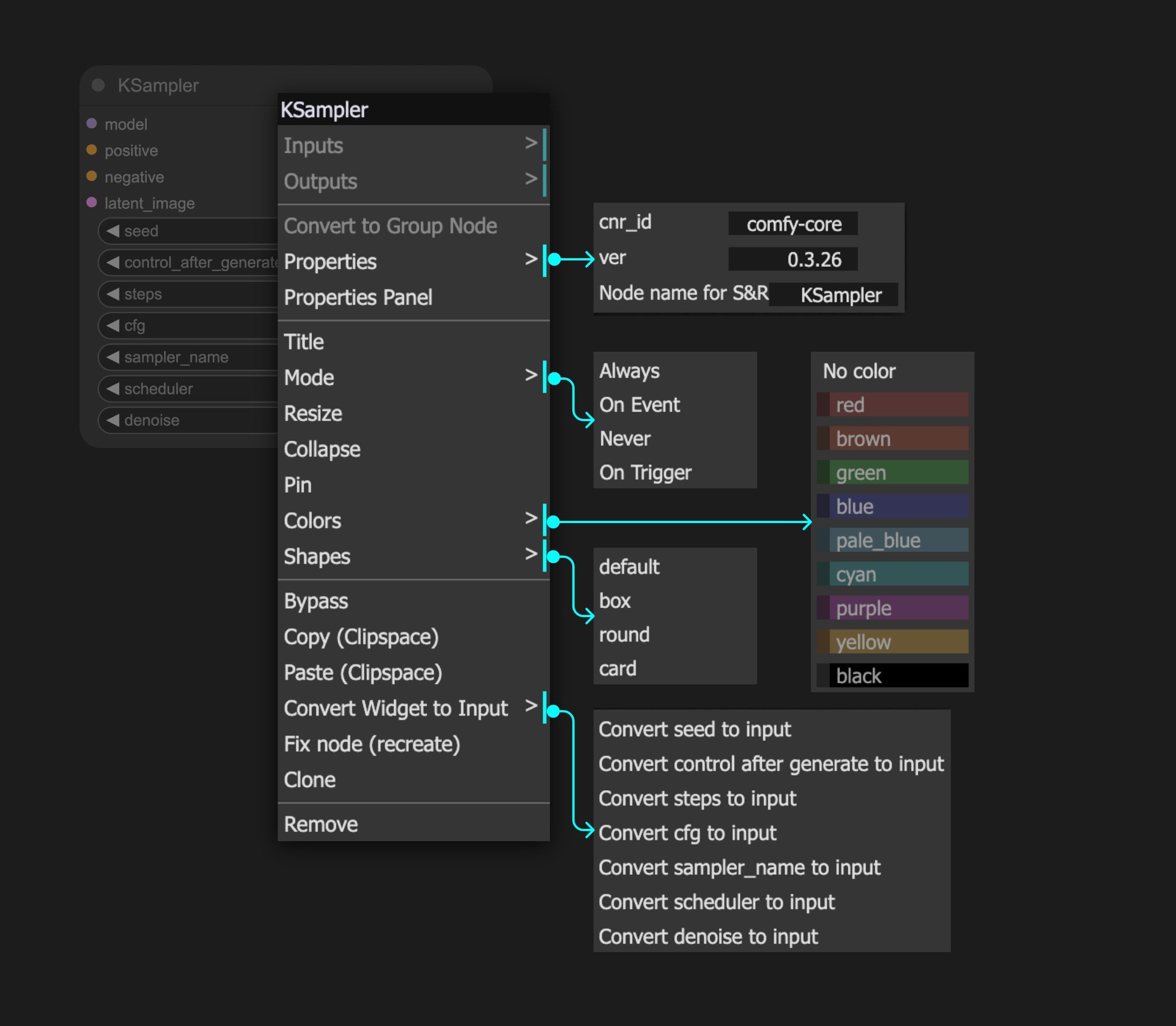
- Adjust the node’s color style
- Modify the title
- Clone, copy, or delete the node
- Set the node’s mode
- Mode: Set the node’s mode: Always, Never, Bypass
Mode
For modes, you may notice that we currently provide: Always, Never, On Event, On Trigger - four modes, but actually only Always and Never are effective. On Event and On Trigger are currently ineffective as we haven’t fully implemented this feature. Additionally, you can understand Bypass as a mode. Below is an explanation of the available modes:- Always: The default node mode. The node will execute whenever it runs for the first time or when any of its inputs change since the last execution
- Never: The node will never execute under any circumstances, as if it’s been deleted. Subsequent nodes cannot read or receive any data from it
- Bypass: The node will never execute under any circumstances, but subsequent nodes can still try to obtain data that hasn’t been processed by this node
Never and Bypass modes:
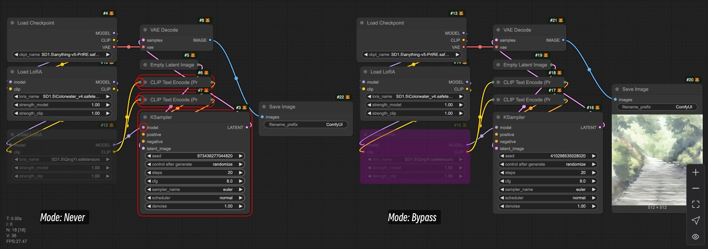
Load LoRA node is set to Never mode while the other is set to Bypass mode.
- The node set to
Nevermode causes subsequent nodes to show errors because they don’t receive any input data - The node set to
Bypassmode still allows subsequent nodes to receive unprocessed data, so they load the output data from the firstLoad LoRAnode, allowing the subsequent workflow to continue running normally
Input/Output Context Menu
This context menu is mainly related to the data type of the corresponding input/output: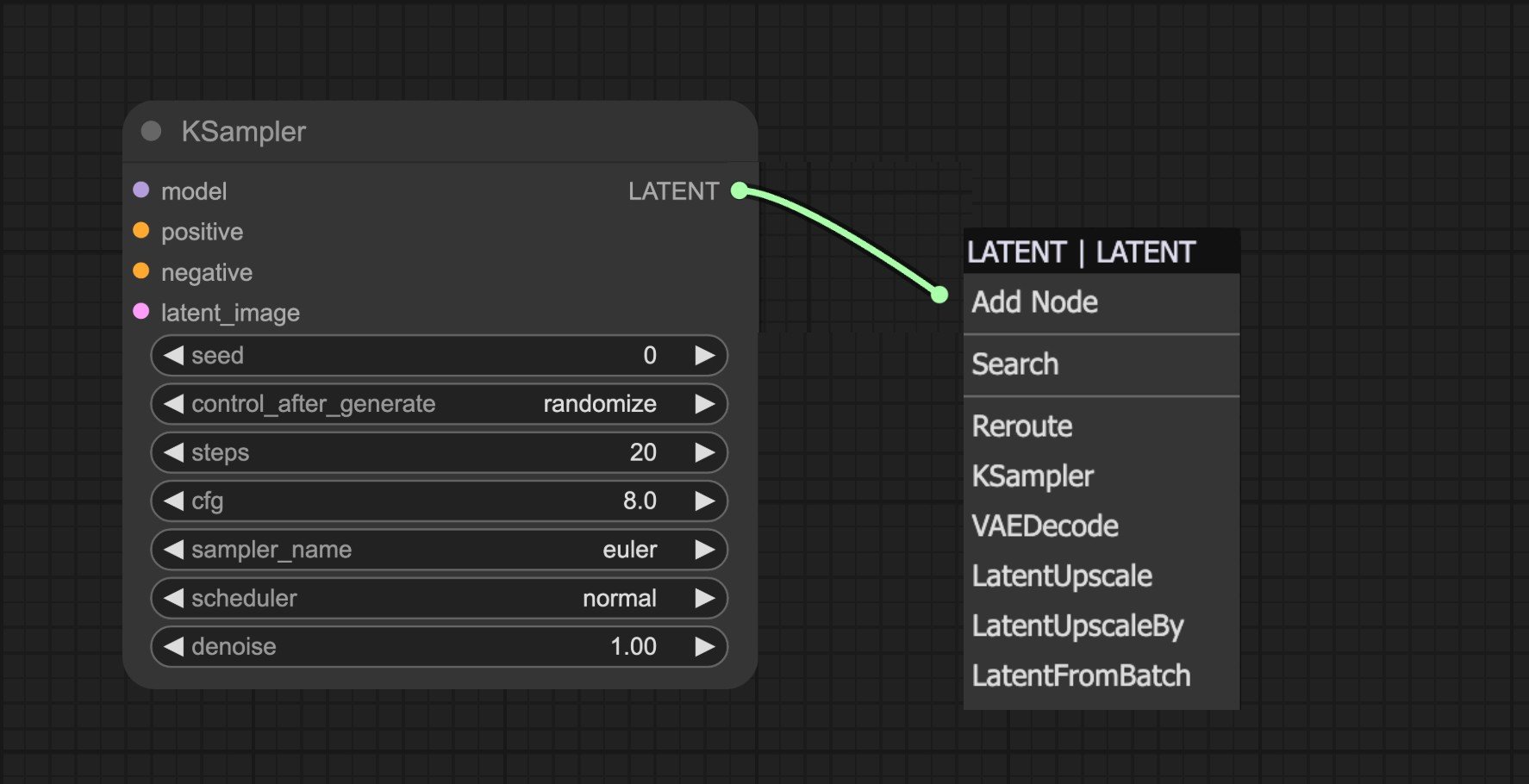
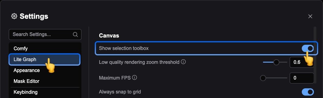
Node Selection Toolbox
The Node Selection Toolbox is a floating tool that provides quick operations for nodes. When you select a node, it hovers above the selected node. Through this toolbox, you can:- Change the node’s color
- Quickly set the node to Bypass mode (not execute during runtime)
- Lock the node
- Delete the node
Subgraphs
You can collapse a selection of nodes into one reusable subgraph node to tidy complex graphs and reuse the same structure across workflows.Subgraph
Learn how to create, edit, nest, and publish subgraph blueprints to the node library.
Custom Nodes
ComfyUI includes many Comfy Core nodes in the base installation. The community also maintains a large catalog of custom nodes for specialized workflows. For a full summary of how to install custom nodes—ComfyUI Manager, Git clone, ZIP download, dependencies, and safety tips—see How to install custom nodes.ComfyUI Manager
Use ComfyUI Manager for everyday custom node work: search and install from the registry, update or disable packages, detect missing nodes from imported workflows, and manage models and snapshots alongside extensions. Desktop builds ship with it enabled; portable and manual installs may need to turn it on first.ComfyUI Manager
Overview, enabling the Manager, and node installation workflows